

I have become aware more recently of my transition from all out fine artist to graphic designer, but felt that really there is more to it than that, I will always be a fine artist too and feel that part of what that gives me is an alternative perspective on things. I am always questioning and trying to find another way and felt that "Graphic Explorer" was more akin to what I had become. Exploring not only within my work but my ideas, lifestyle, city and world.
With that in mind I wanted to try and express that and also develop my skills in creating logos whilst also keeping my portfolio in mind and how I could add diversity to it.
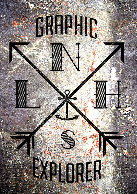
I decided to use a modern take on traditional styles to tie in with the themes of my urban exploration and capturing and taking back the history of the city. I also like the idea of early discovery and exploration and so felt some nautical features would also work well and link to my interests in travel and old school tattoos. I wanted to create something that could work well with various textures to again link to the urban narrative of my work. I also find the idea of arrows interesting as it both suggests finding your own path but could also be interpreted as being forced into one direction depending on your viewpoint.

I then began to look at putting these logos into some context and onto some different surfaces, background and photographs. I think this is really where the logos have their effectiveness and the background really does change the reading of them and also vice versa. It makes us see, especially the cobbles, the location through a different set if ideas than we are usually presented with.

I feel taking my work out and actually into these types of places or working more closely with the fabric of the city is the next stage in the development of my work. But as a logo experiment I am pleased with what I have produced.