
It turns out that coming up with a name and a concept for a joint publication is a lot harder than you first think, so many ideas and opinions to work through. So we got the ball rolling with round table discussions and decided that we would work on some logo ideas for a few names we came up with to see if that made our minds up.
My name idea was "Umbrella" I felt it was quite playful and represented the city of Manchester quite with (being famous for our amazing weather of course) and also reflected the idea of a collaborative project.

We also played with the idea of the name "BÜRO" after deciding our theme would be"Misplace". We liked the idea of the German word being out of place although personally I felt Umbrella had more to give, and umbrellas are also something often misplaced and for me connect to the idea of giving an everyday object a new context.
I think we all wanted this project to be something in which we could relate our work to but at the same time would give us the chance to see that work in a new light and for me I think "Misplace" really allows me that.

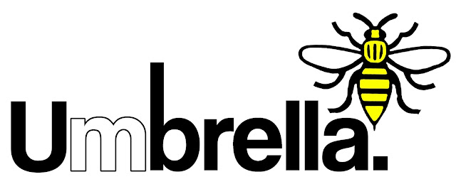
For this logo I wanted to keep it quite simple and the word itself is quite long and has a lot of associated connotations and readings and I didn't want to detract from that. I played around with making the M stand out for Manchester and also taking aspects of the coat of arms such as the Bee. I also created two arrow like icons above the b to play with the form and shape of an Umbrella as well as the idea of location and misplacement. I initially though about using both Red and light blue for colours to relate to both Manchester City and United but felt the yellow worked better as it was more neutral and a related to the coat of arms/ Bee and also Factory records.

I really enjoyed the challenge of this project and look forward to seeing how it develops.