30 Sept 2012

BURO Publication Logo Creation.

We have been working on ideas for the joint publication for the MA Design and Art Direction students and after some deliberation we finally came up with a name and I was chosen to work on the logo.  

publication, logo, buro, mmu, zine, text, type, experiment, graphic design, design, manchester, collaboration


It was decided that "Buro" was preferred to my suggestion of  "Umbrella" and although I did think mine had a better overall connotation I felt a little better after my logo idea was to be taken further. I did realise that Buro was stylistically better to work with and so looked forward to playing around with it. 

We did some doodling as a group and then chose which ideas we liked the most. Out of them all a sketch I did was chosen to be developed further and so I set about looking at what I could do with it. 


publication, logo, buro, mmu, zine, text, type, experiment, graphic design, design, manchester, collaboration

publication, logo, buro, mmu, zine, text, type, experiment, graphic design, design, manchester, collaboration


publication, logo, buro, mmu, zine, text, type, experiment, graphic design, design, manchester, collaboration

publication, logo, buro, mmu, zine, text, type, experiment, graphic design, design, manchester, collaboration


publication, logo, buro, mmu, zine, text, type, experiment, graphic design, design, manchester, collaboration


publication, logo, buro, mmu, zine, text, type, experiment, graphic design, design, manchester, collaboration


publication, logo, buro, mmu, zine, text, type, experiment, graphic design, design, manchester, collaboration

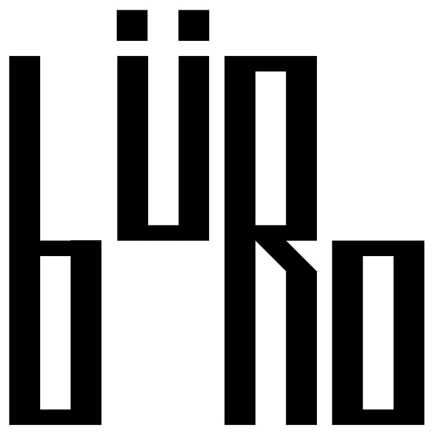
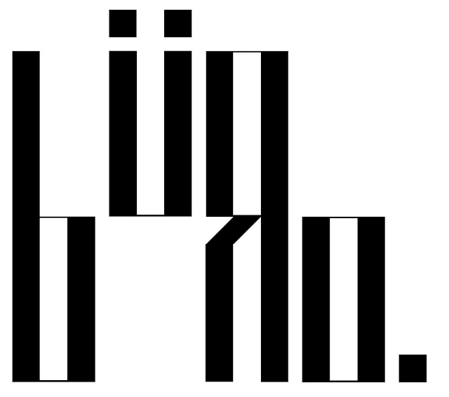
I am really pleased with what I have come up with here and feel as I got more confidence I tried more experimental layouts and came up with some I think work really well. I think the more abstract designs work the best visually but obviously we need the name to be legible so on balance I feel the last one here is the most likely to be used. 

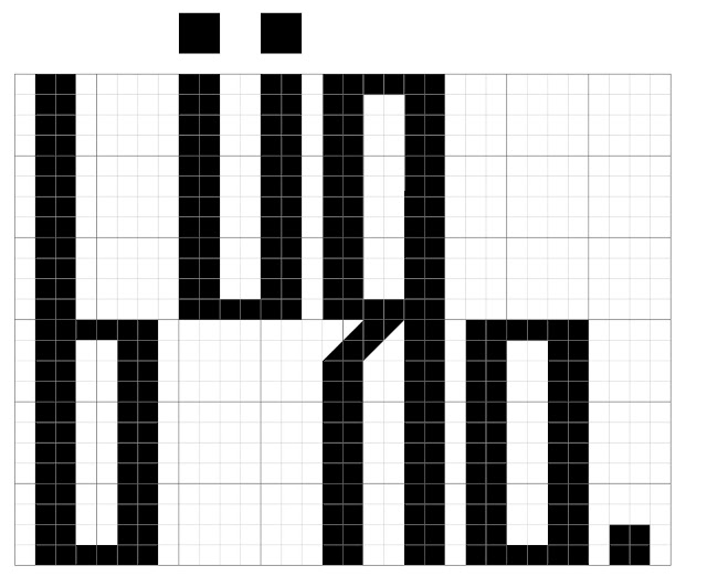
One of the things we liked about this idea was the grid like form it takes and how that has an urban feel to it and represents the city quite well. 

Posts You Might LIke