One of the things I liked about it was the way it was challenging how we see our environment, how we read it and how it plays with the signs and language of the street. I had been thinking about re designing some of the signs, especially ones which prohibit and direct, found in Manchester and after this I will most likely extend the project to become much more a part of my practice.
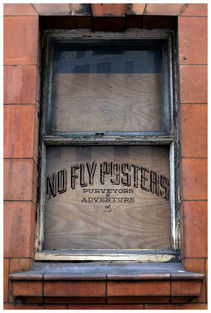
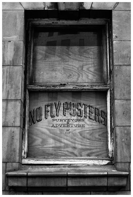
The fact these are on boarded up windows is another aspect that I like, it relates to the idea of there being something hidden and concealed. The fact this is also in Ancoats makes it all the more reliant as my work is mostly about Manchester, my city, my main source of exploration and inspiration as I look to transform the everyday and familiar into something strange and exciting.
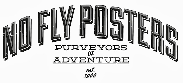
The idea of the window was really the starting point to this idea, that these were to be covering up boarded up factory and industrial windows once so important to the city and now overlooked at forgotten. A window as something to look into and also out of, a view of the world or a reminder of a time now passed.
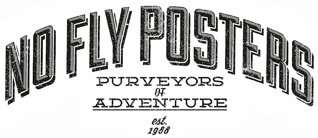
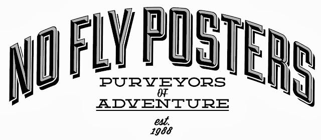
I wanted the lettering to reflect the history and heritage of Ancoats with the it's importance in both the industrial revolution and global politics. To be of a style that reflects the old signage of companies that would have adorned all these windows, giving them a sense of identity the generic "No Fly Posters" has denied, leaving them faceless derelict buildings instead of sites of a historical period which changed the world forever.
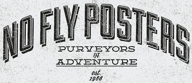
I also think it is interesting in how the presentation and the subject matter tackle different issues and eras and yet when put together it starts to really become something intriguing and almost uncanny and brings together many of my ideas.
I decided for the submission to mock this design up onto a window but if I am honest I feel I could have done something a little better and don't think this mock up does the design the justice it deserves. But really it was just a mock up and maybe I was a little hasty in my submission, I would like to look at this again and develop it, maybe screenprinting and using found objects. Overall though I am really pleased with the outcome of the logo, it's style and texture.


