Letterhead Designs. This one is a little different to my usual practice but as I am trying to get together my portfolio and develop my professional practice I was grateful of the opportunity to have a go at this.
As part of my professional and portfolio development I have been looking out for competitions and briefs as well as working on my main practice. I came across this call up to design the National Student Survey poster and felt it was a great opportunity. CLICK THROUGH
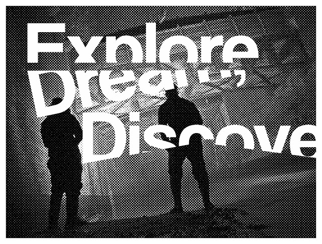
I have been focused recently on developing my skills and portfolio and as part of that I wanted to really show off my new found confidence and identity as a "Graphic Explorer". I wanted to almost brand myself and experiment with this definition in a logo format.
I was approached recently to design an emblem to be etched into glass for a wedding gift. This was great for me as I am always looking at new ways to express myself and my style and also gaining more experience as I go.
I had come across a project being run by a classmate and decided I would produce something for submission. After playing around with some ideas and designs I came up with something that in fact began to mean a lot more to my practice itself and helped me kick start this semester.
Finally after much planning, deliberation and discussion we had the launch for our joint publication at Odder Bar in Manchester. It was great to have something in motion for the start of practice two and also have some work published.
I decided to bring together some of the logo work with the photography I had been doing and my wider ideas to create a poster which I felt represented the stage of development my practice was at. I experimented with both screenprinting and the Risograph to get a sense of how this may effect the image.
I have been interesting in the idea of creating a logo to represent the idea of exploration which brings together the atmosphere, remnants and texture of the urban environment it is inspired by. I decided to take this a little further by then screenprinting that logo onto objects found in the city.
After playing around in the Letterpress studio for the last few weeks I thought it might make an interesting experiment to look at an alternative form of "Tagging" using luggage tags to connect to the idea of interaction, history and craft as opposed to vandalism.
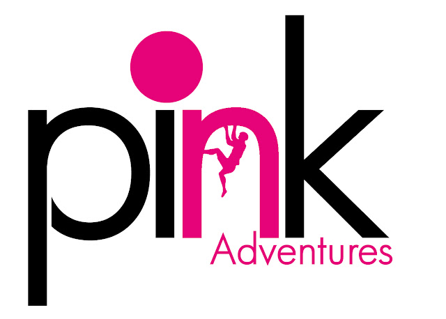
I have been working on Freelance designs and logos recently and have been on the look our for new opportunities or thinks I can re-design. The climbing gym I go to has been taken over by a company called "Pink Adventures" and although I quite like their name and concept I hated their logo. I just did something quite to get an idea of what was possible but I feel that there is much more that could be done here
After playing around with logos and printing onto found objects I wanted to experiment further with creating interventions using everyday objects and transforming them into pieces communicating the opportunities the city has to offer which we often walk past without even realising.
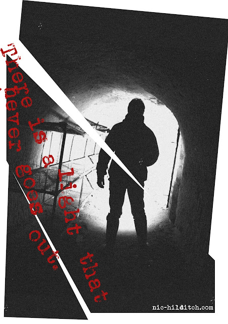
These posters are something I did whilst playing around with some other ideas and just wanted to express this idea that for many it is a fear of something, whether that be failure, disappointment, disapproval or even injury. It is that fear that ultimately keeps us in the safety of normality and makes us settle for less than our dreams. I have learnt recently that feeling fearful is not wrong, but how you deal with it.
Interventions have become increasingly important in the development of my work as I feel they allow me to really communicate with the city itself, create a narrative between my work and the environment and also directly communicate with the general public. I decided to take that further with some infiltration art in the Arndale Shopping centre (Mall).
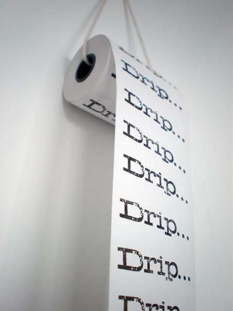
I've been quite busy recently getting a lot of my ideas going and wanted to play with a till roll and the idea that this "Drip Drip Drip" was the never ending beat of the forgotten city below us.
I got the idea a little while back that in representing a place it is the earth, the dirt and the make up of that place where the reality of it exists. It represents the fabric and physicality of that location. So to explore this a little further I created a piece using Manchester as both my subject matter and my media.
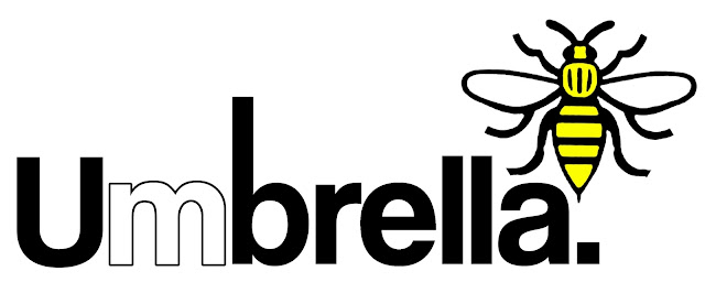
Over the last few weeks we have been talking about producing a joint publication for the MA Design and Art Direction students at MMU. One of the things we are still in the process of disguising is the name and so I did a few logo experiments with my suggestion of "Umbrella".
I have recently created a series of posters which challenge the idea of rules and our complicitness in accepting those rules without questioning the motives behind them, especially when it comes to our navigation of environment.
I have been playing around with the Letterpress for the last few weeks, playing with lots of ideas and making a lot of progress. The letterpress is great in how it adds a level of tradition and value to text it's computer generated relation just doesn't have.
We have been working on ideas for the joint publication for the MA Design and Art Direction students and after some deliberation we finally came up with a name and I was chosen to work on the logo.